/* Common styles for all devices */
.subcat-link {
color: #555555;
text-decoration: none;
font-weight: normal;
}
.subcat-circle {
padding: 10px;
width: 134px !important; /* Default width with !important */
}
/* Styles for mobile devices (up to 767px) */
@media (max-width: 767px) {
.subcat-circle {
width: 106px !important; /* Adjust the width for mobile with !important */
}
}
/* Styles for tablets (768px to 991px) */
@media (min-width: 768px) and (max-width: 991px) {
.subcat-circle {
width: 134px !important; /* Adjust the width for tablets with !important */
}
}
/* Styles for desktop devices (992px and above) */
@media (min-width: 992px) {
.subcat-circle {
width: 150px !important; /* Adjust the width for desktop with !important */
}
}
/* Reset some default styles for consistency */
body, h1, p {
margin: 0;
padding: 0;
}
/* Style for the content block */
.custom-content-block-2 {
display: flex;
flex-wrap: wrap;
justify-content: space-between;
padding: 20px;
background-color: #fff; /* Set your desired background color */
}
/* Style for the text section */
.custom-text-section-2 {
flex: 1; /* Take up 1/3 of the width in a two-column layout */
max-width: 33%; /* Restrict to 1/3 of the width */
box-sizing: border-box; /* Include padding in the width calculation */
padding: 10px; /* Add padding around the text */
}
/* Style for the title */
.custom-text-section-2 h2 {
font-size: 40px;
margin-bottom: 10px;
}
/* Style for the subtitle */
.custom-text-section-2 p {
font-size: 16px;
margin-bottom: 10px;
}
/* Style for the shop link */
.custom-text-section-2 a {
display: inline-block;
padding: 0px;
background-color: none; /* Set your desired link color */
color: #0065ab; /* Set your desired text color */
text-decoration: underline;
border-radius: 5px;
}
/* Style for the image section */
.custom-image-section-2 {
flex: 2; /* Take up 2/3 of the width in a two-column layout */
max-width: 66%; /* Restrict to 2/3 of the width */
box-sizing: border-box; /* Include padding in the width calculation */
padding: 10px; /* Add padding around the image */
}
/* Style for the image itself */
.custom-image-section-2 img {
width: 100%;
height: auto;
display: block;
}
/* Media query for mobile view */
@media (max-width: 768px) {
.custom-content-block-2 {
flex-direction: column; /* Set to column for mobile view */
}
.custom-text-section-2,
.custom-image-section-2 {
max-width: 100%; /* Take up full width on mobile */
padding: 10px; /* Adjust padding for better mobile spacing */
}
}
.main-content > .block-wrapper {
display: none;
}
.img-link-blk:hover a {
text-decoration: underline;
}
/* Styles for mobile devices (up to 767px) */
@media (max-width: 767px) {
.clpSpecialOfferPromoContainer {
flex-basis: 50% !important; /* Adjust the width for mobile with !important */
}
}
/* Styles for tablets (768px to 991px) */
@media (min-width: 768px) and (max-width: 991px) {
.clpSpecialOfferPromoContainer {
flex-basis: 50% !important; /* Adjust the width for tablets with !important */
}
}
/* Styles for desktop devices (992px and above) */
@media (min-width: 992px) {
.clpSpecialOfferPromoContainer {
flex-basis: 50% !important; /* Adjust the width for desktop with !important */
}
}
/* Flex Container */
.flex-container-clp-special-offer {
display: flex;
align-items: stretch; /* Ensure equal height for flex items */
}
/* Content Block */
.content-block {
display: flex;
padding: 20px; /* Adjust padding as needed */
background-color: #ffffff; /* White background color */
border-radius: 10px; /* Adjust border radius for rounded corners */
border: 1px solid #fff; /* Add a border with the desired color */
box-shadow: 0 0 8px rgba(0, 0, 0, 0.05); /* Optional: Add a subtle box shadow */
margin: 10px; /* Adjust margin around the block */
}
/* Image Container */
.image-container {
padding-right: 20px; /* Adjust padding around the image */
flex-grow: 1; /* Ensure equal height with the text container */
}
.image-container img {
max-width: 100%;
height: auto;
display: block;
}
/* Text Container */
.text-container {
flex-grow: 1;
width: 100%;
color: #555; /* Adjust text color for the text container */
}
.text-container a {
color: #555; /* Adjust link color */
text-decoration: none; /* Remove default underline */
transition: color 0.3s ease, text-decoration 0.3s ease; /* Add transition for smooth effect */
}
.text-container:hover a {
color: #0065ab; /* Adjust link color on hover */
text-decoration: underline; /* Add underline on hover */
}
.text-container h2 {
font-size: 2.4em; /* Adjust title font size */
margin-bottom: 0px; /* Adjust spacing */
}
.text-container p {
font-size: 1.3em; /* Adjust subtext font size */
margin-bottom: 10px; /* Adjust spacing */
padding-bottom: 10px;
}
.text-container a {
font-size: 1em; /* Adjust link font size */
text-decoration: none;
color: #0065ab; /* Blue color */
}
p:only-of-type:not([class]) {
margin-bottom: 0;
font-weight: normal;
}
/* Content Block Hover Effect */
.content-block:hover {
box-shadow: 0 0 8px rgba(0, 0, 0, 0.05); /* Add a stronger box shadow on hover */
border: 1px solid #fff; /* Add a border on hover with the desired color */
}
/* Responsive Styles for Text Container and Image Container */
@media screen and (max-width: 768px) {
.content-block {
flex-direction: column;
}
.image-container {
padding-right: 0; /* No padding around image on smaller screens */
margin-bottom: 10px; /* Adjust spacing between image and text on smaller screens */
}
.text-container {
width: 100%; /* Full width for text container on smaller screens */
}
}
/* Additional Responsive Styles for Larger Screens if Needed */
@media screen and (min-width: 992px) {
.text-container {
max-width: 60%; /* Adjust maximum width for text container on larger screens */
}
.image-container {
max-width: 33%; /* Adjust maximum width for image container on larger screens */
}
}
Transform your kitchen into a creative haven, where food and fun coexist in perfect harmony. Imagine opening the door not just to another room but rather stepping into a whole new universe filled with endless culinary opportunities. This isn't merely about preparing meals; it's about embarking on delicious journeys right from the comfort of your home.
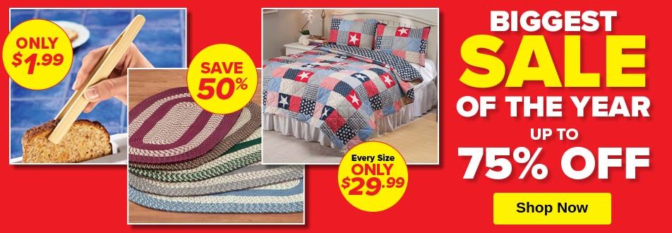
Kitchen Accessories for Smart Shoppers
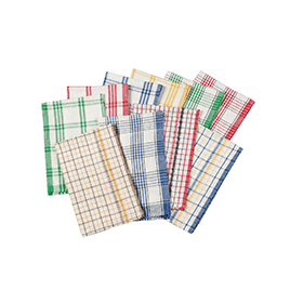
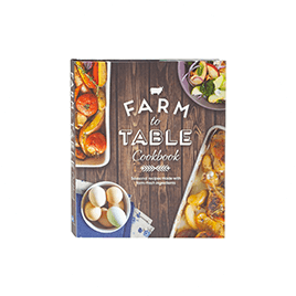
Miles Kimball is a chef’s dream with hundreds of kitchen items to choose from including linens, tablecloths, towels, organizers, bakeware, cookbooks, gadgets and more. We carry everything you need to work your magic in the kitchen whether you’re a home chef or a seasoned professional. Shop for everyday basics like kitchen towels or snag that specialty gadget you’ve had your eye on. At Miles Kimball, we offer a huge selection of kitchen products at affordable prices so you can always have the coolest kitchen on the block.
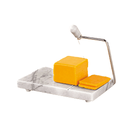
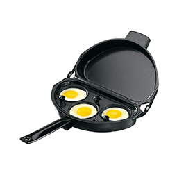
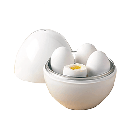
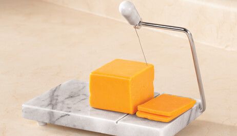
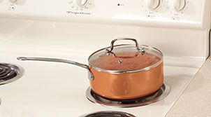
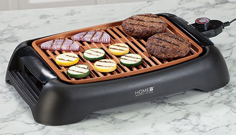
Cookware for Every Chef
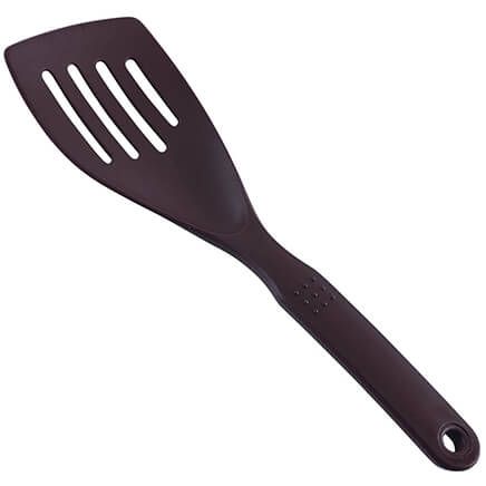
Discover a wide range of cookware options, from non-stick pans and durable pots to versatile bakeware. Whether you're a seasoned chef or just getting started, our selection ensures you have the right tools to prepare your favorite dishes with ease. Get ready to transform each meal into an occasion with our thoughtful selection designed just for you. Whether you're looking for high-tech tools or classic pots and pans, we've got what it takes to whip up tasty meals and make your kitchen feel like home.
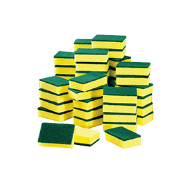
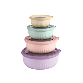
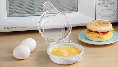
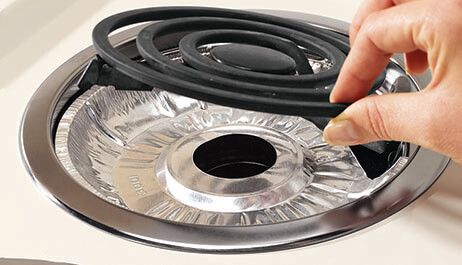
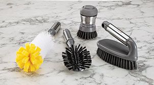
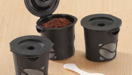
Streamline your kitchen tasks with our innovative gadgets and utensils. Explore items that simplify chopping, slicing, and cooking, making meal preparation a breeze. From handy can openers to space-saving kitchen organizers, we have solutions for every kitchen need.
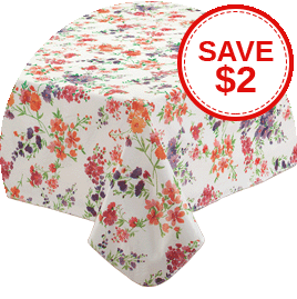
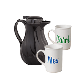
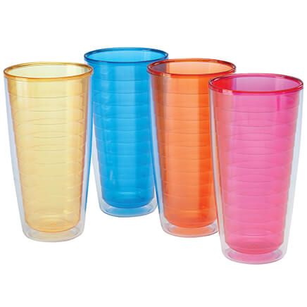
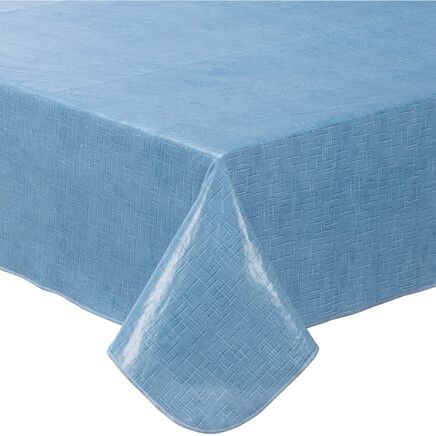
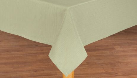
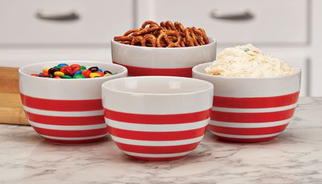
Tabletop Elegance
Elevate your dining experience with our selection of elegant tableware and dinnerware. Browse through our beautiful dishes, glassware, and table covers and table cloths that add style to your table settings and impress your guests.
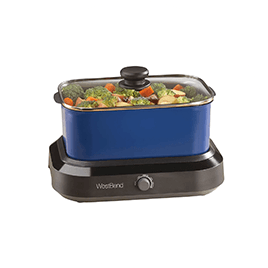
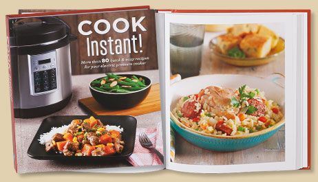
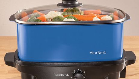
Small Appliances
Upgrade your kitchen with our range of small appliances, including coffee makers, blenders, and food processors. Enjoy the convenience of preparing your favorite beverages and meals effortlessly.
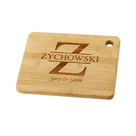
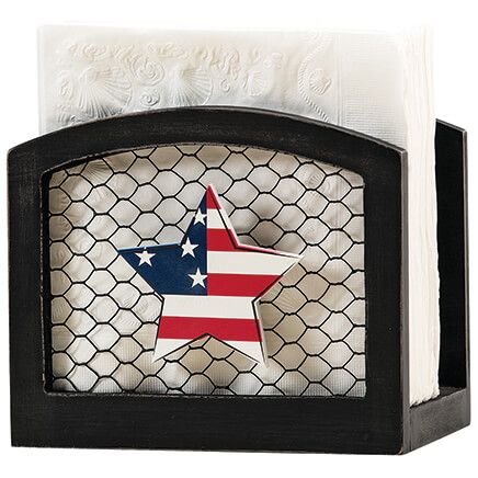
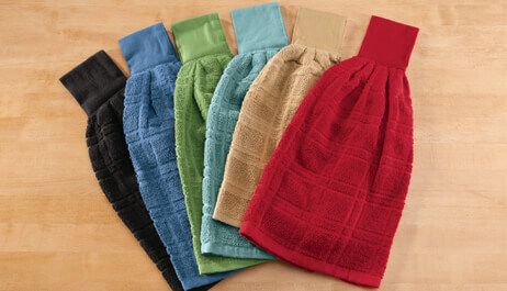
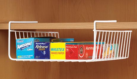
Kitchen Decor and Organization
Make your kitchen a stylish and organized space with our decor and organization solutions. Choose from decorative kitchen towels, themed wall art, and clever storage options that enhance both form and function.
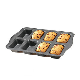
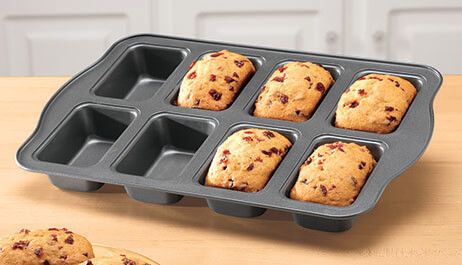
Baking and Pastry Essentials
Indulge your sweet tooth or bake for special occasions with our baking and pastry essentials. Find cake decorating supplies, cookie cutters, and everything you need to create delectable treats.
Quality You Can Rely On
At Miles Kimball, we prioritize quality and durability in every kitchen product we offer. We source the finest materials to ensure our items stand up to the rigors of daily cooking and dining.
Inspiration and Innovation
Our commitment to providing innovative kitchen solutions is matched only by our dedication to inspiring culinary creativity. We're here to support you in exploring new recipes, techniques, and flavors.
Whether you're a seasoned home chef or just looking to enhance your cooking experience, Miles Kimball's Kitchen collection has the tools and inspiration you need. Shop now to transform your kitchen into a hub of culinary delight, where delicious meals and cherished memories are made.